Filling out forms on the web isn't the most exciting activity in the world, especially when you enter something the website doesn't expect. Most websites do a pretty poor job giving you feedback. For example, you submit your data, it reloads the page, deletes half the things you entered, and tells you "Please enter a password with 2 lower case letters, 4 uppercase letters, a number, and an even number of %^&# characters". 🤦 Lol & thanks, every travel or banking website I have ever used.
This feedback is called form validation. An example:
Many websites still roll their own form validation system, and making a something good from scratch is not a simple affair.
Obviously, your users deserve a good experience when they get something wrong. And you deserve minimal pain in building out this experience.
Fortunately today's browsers have form validation features built in. These features are pretty good now and are actually supported by 🎉 all current browsers 🎉. As with many browser features, there are warts. But you can work around them with a small amount of code and have something that feels good.
I'm hoping this post exposes a couple more people to HTML5 form validation, or shows folks the current capabilities if they haven't looked at these features in a while.
Just want the TL;DR and the code? Check out the valid-form project; a JavaScript library using the techniques from this blog post. You can also see it in action.
Example 1: The Basics
There are three categories of HTML5 form validation features:
- HTML attributes on
<input>,<select>, and<textarea>elements. (From here on out, I will just refer to them all as<input>cause brevity) - CSS pseudo selectors
- JavaScript APIs
And you can choose your own adventure. The only thing required to start validating is using a couple HTML attributes, which is crazy easy. So let's start there.
We'll add a required attribute to an <input> to ensure the user needs to put something in the email address box. We'll also set the input's type="email" which will render a text box but only allow email addresses. Notice you cannot submit the form unless you fill it out with an email address. This is just HTML, no JavaScript!
<form>
  <label>Your Email</label>
  <!-- `required` and `type="email"` does everything! -->
  <input
    required
    type="email"
    name="email"
    placeholder="a@b.com" />
</form>
Boom💥! 20 characters in HTML gave us validation! Now that we have it working, you might have a couple questions:
- How do I style the
<input>when it is valid or invalid? - Can I specify custom error messages? If so, how?
- How do I style the error message?
So let's dig into each one of these with an example. We will build step-by-step on the simple example above until we have something more custom and attractive.
Example 2: Styling the input
There are a couple CSS pseudo classes supported by each <input>. Two potentially useful selectors in this situation:
:valid- when the input is valid:invalid- when the input is invalid
The most basic approach would be to change the border color when the input is invalid on our previous example:
/* CSS :invalid pseudo selector */
input:invalid {
  border-color: red;
}
Notice, though, that it isn't very good. What is even happening?
- The input is
requiredand initially empty, so on page load the input is:invalidand border is red. :( :( - The input is
:invaliduntil you type a legit email address, so it is red when typing. :( :(
Ok, so the :invalid pseudo selector is kind of useless. Ideally we would not show an error up front or the whole time they are typing, just when they submit something unacceptable.
Dave Rupert has a good solution that uses an input's invalid event. Instead of using the :invalid pseudo selector, he adds a CSS class to the input when it becomes invalid. We will extend this approach by removing the CSS class when the element becomes valid again.
The CSS
/* .invalid CSS class instead or pseudo selector */
input.invalid {
  border-color: red;
}
And the JavaScript will add the invalid class when the input is invalid
var invalidClassName = 'invalid'
var inputs = document.querySelectorAll('input, select, textarea')
inputs.forEach(function (input) {
  // Add a css class on submit when the input is invalid.
  input.addEventListener('invalid', function () {
    input.classList.add(invalidClassName)
  })

  // Remove the class when the input becomes valid.
  // 'input' will fire each time the user types
  input.addEventListener('input', function () {
    if (input.validity.valid) {
      input.classList.remove(invalidClassName)
    }
  })
})
Better, eh?
This behavior feels better because you are punished with an error only after you try to submit with a unacceptable answer, not while you are typing a potentially legit answer. Plus you get immediate feedback when you correct an error. 🎉
Example 3: Custom Messages
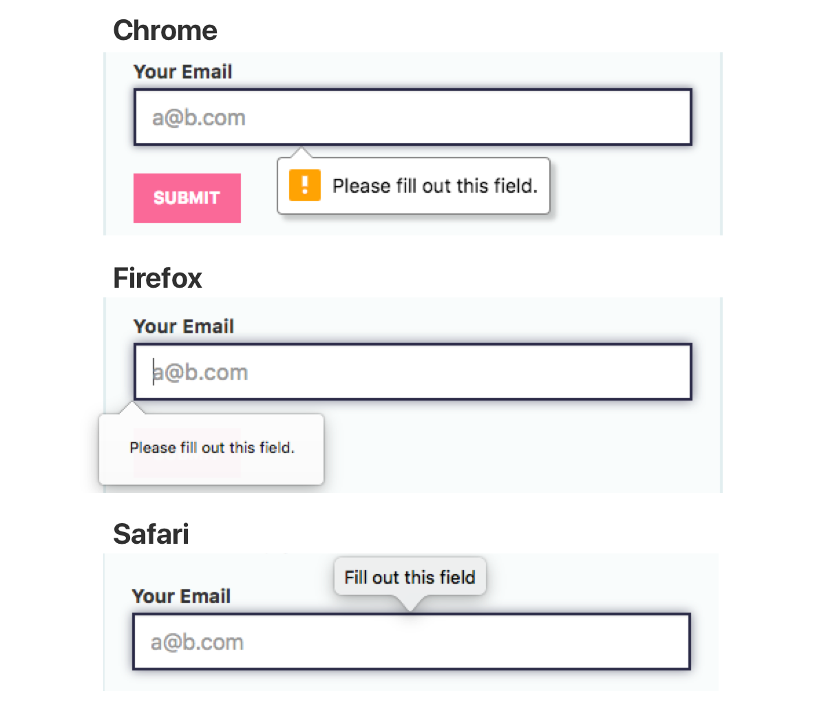
The browser provides default error messages. But they are super generic—"Please fill out this field", etc.—and may not be what you want.
Generic as they may be, there is an upside to sticking with the default error messages: default errors are translated into the user's local language. e.g. If a user is reading your site in German, the default error messages will be in German also.
The key to custom messages is using an input HTMLElement's setCustomValidity function, e.g. input.setCustomValidity('My custom message'). You can call this function at any time. If you pass a non-empty string, it will treat the input as invalid and not allow form submission. It is a flexible function. For example, it can be used to build your own validation for custom types.
But setCustomValidity is a bit cumbersome for custom messages as you can't just override a specific message. It's "show this error no matter what" or nothing.
<input> HTMLElements also have a validity object that tells you what, if anything, on the element is invalid. We can use input.validity in conjunction with input.setCustomValidity() to override specific messages.
// The keys (e.g. valueMissing) map onto
// a key in the `input.validity` object
const customMessages = {
  valueMissing:    'Custom required!',       // `required` attr
  emailMismatch:   'Custom email mismatch',  // Invalid email
  patternMismatch: 'Custom pattern mismatch',// `pattern` attr
}

function getCustomMessage (type, validity) {
  if (validity.typeMismatch) {
    return customMessages[`${type}Mismatch`]
  } else {
    for (const invalidKey in customMessages) {
      if (validity[invalidKey]) {
        return customMessages[invalidKey]
      }
    }
  }
}

var inputs = document.querySelectorAll('input, select, textarea')
inputs.forEach(function (input) {
  // Each time the user types or submits, this will
  // check validity, and set a custom message if invalid.
  function checkValidity () {
    const message = input.validity.valid
      ? null
      : getCustomMessage(input.type, input.validity, customMessages)
    input.setCustomValidity(message || '')
  }
  input.addEventListener('input', checkValidity)
  input.addEventListener('invalid', checkValidity)
})
You could extend this technique even further by passing in a special customMessages object for each <input>, or having it read custom attributes on the <input> containing the messages. FWIW, valid-form (a JS lib based on this post) does support custom attributes.
Example 4: Custom Message Rendering
Unfortunately the browser doesn't give you any control over styling the default error message display, and they are (of course) different on every browser.
But you can render your own element when there is an error. Basically, you just hook the same events as the other examples, and insert a div wherever you like with the error. This example is the same as above, but it will show the error message next to the label instead of as a tooltip thing under the input.
const validationErrorClass = 'validation-error'
const parentErrorClass = 'has-validation-error'
const inputs = document.querySelectorAll('input, select, textarea')
inputs.forEach(function (input) {
  function checkValidity (options) {
    const insertError = options.insertError
    const parent = input.parentNode
    const error = parent.querySelector(`.${validationErrorClass}`)
      || document.createElement('div')

    if (!input.validity.valid && input.validationMessage) {
      error.className = validationErrorClass
      error.textContent = input.validationMessage

      if (insertError) {
        parent.insertBefore(error, input)
        parent.classList.add(parentErrorClass)
      }
    } else {
      parent.classList.remove(parentErrorClass)
      error.remove()
    }
  }
  input.addEventListener('input', function () {
    // We can only update the error or hide it on input.
    // Otherwise it will show when typing.
    checkValidity({insertError: false})
  })
  input.addEventListener('invalid', function (e) {
    // prevent showing the default display
    e.preventDefault()

    // We can also create the error in invalid.
    checkValidity({insertError: true})
  })
})
Get The Code
I created a small JavaScript library that rolls up all three techniques from this post so you dont have to: valid-form. You can also see it in action.
Server Validation
The HTML5 form validation techniques in this post only work on the front end. Someone could turn off JavaScript and still submit jank data to a form with the tightest JS form validation.
To be clear, you should still do validation on the server. How you display those errors to a user is up to you. With these JavaScript techniques, the display of server validation errors could be a lot simpler if you expect most of your users to have JS enabled. For example, Rails still encourages you to dump all validation errors at the top of a form, which is lulzy in this age of touchy UX. But you could do that minimal thing with server errors, then rely on HTML5 validation to provide a good user experience for the vast majority of your users.
Reference
The examples in this post didn't show absolutely all the validation possibilities. Here are a couple quick tables that hopefully help in your validation quest.
HTML Validation Attributes
Using these attributes will show validation errors, or limit what the user can enter into an <input>.
| Attribute | Notes |
|---|---|
<input required> | Ensure the user enters at least one character |
<input minlength="2"> | Ensure the <input> has a length greater than or equal to the value specified |
<input maxlength="10"> | Ensure the <input> has a length less than or equal to the value specified |
<input pattern="[a-z]+"> | Match a regular expression |
<input min="2"> | Number value must be >= the value. Only works on type="number" or type="range" inputs! |
<input max="10"> | Number value must be <= the value. Only works on type="number" or type="range" inputs! |
<input step="2"> | Number value must be a multiple of this number. Only works on type="number" or type="range" inputs! |
<form novalidate> | Disable HTML5 form validation for the form. |
HTML Type Attributes
In addition to the validation attributes, you should use the correct type attribute for your input. e.g. for email addresses, you should use type="email", for numbers, you should use type="number". Some types provide extra validation, and will show a message when the input does not match the type. These types will show error messages:
| Type | Notes |
|---|---|
email | Input must be a valid email address. |
url | Input must be a URL that starts with http. |
number | Input must be a number. |
There are many more acceptable values for the type field. Using the correct type may save you from having to validate an input at all, yay.
CSS Pseudo Classes
You can style <input>s in various states with a couple pseudo selectors.
| Pseudo Selector | Notes |
|---|---|
:valid | When the input is valid |
:invalid | When the input is invalid |
:required | When the input has a required attribute |
:optional | When the input does not have a required attribute |
Validity State
Remember the object with custom messages above?
const customMessages = {
  valueMissing:    'Custom required!',       // `required` attr
  patternMismatch: 'Custom pattern mismatch',// `pattern` attr
}
valueMissing etc. are based on an <input>'s input.validity object. e.g. input.validity.valueMissing is true when an <input> requires data from the user.
Here is a table of all values reproduced (with clarifying changes) from the MDN ValidityState docs:
| Property | Note |
|---|---|
valid | Boolean indicating the element meets all constraint validations, and is therefore considered to be valid. When true, all of the following properties in this table will be false. When input.validity.valid === false, one or more of the properties will be true. |
badInput | Boolean indicating the user has provided input that the browser is unable to convert. |
patternMismatch | Boolean indicating the value does not match the regex pattern specified in the pattern attribute. |
rangeOverflow | Boolean indicating the value is greater than the maximum specified by the max attribute. |
rangeUnderflow | Boolean indicating the value is less than the minimum specified by the min attribute. |
stepMismatch | Boolean indicating the value does not fit the rules determined by the step attribute (that is, it's not evenly divisible by the step value). |
tooLong | Boolean indicating the value exceeds the specified maxlength attribute for HTMLInputElement or HTMLTextAreaElement objects. Note: This will never be true in Gecko, because elements' values are prevented from being longer than max attribute. |
tooShort | Boolean indicating the value fails to meet the specified minlength attribute for HTMLInputElement or HTMLTextAreaElement objects. |
typeMismatch | Boolean indicating the value is not in the required syntax (when type is email or url). |
valueMissing | Boolean indicating the element has a required attribute, but no value. |